W3C has finally closed Issue #865, and I couldn’t be happier!
The problem
Leaguepedia1 has a lot of pages with data tables that have a large number of columns and even more rows, such that scrolling in both directions is required if you want to see all of the data.
Naturally, because this is a table of data with labeled columns, we’d like the columns to be sticky at the top of the screen. Normally, this would be no problem; we’d just say position:sticky; top:0;2 and it’d be no problem. Sadly, it’s historically been impossible to have a position:sticky; inside of a container with overflow:auto; (or overflow:hidden;).3
On January 6, 2017, ticket #865 was opened in the css-wg drafts github repo, titled [css3 positioning] support position:sticky inside an overflow:hidden|auto on general parents. Over the years since then, there have been a number of proposals on how to solve this problem, such as:
- Specifying a “sticky ancestor” element, within which all
postion:sticky;properties would be computed - Splitting out
stickyintosticky-xandsticky-y, each of which is valid within the oppositeoverflow-yoroverflow-xancestor - For the case specifically of wanting
overflow:hidden;onroot, make an exception to the behavior of sticky-within-overflow container
But it wasn’t until September 30th, 2026,4 almost a decade later, that ticket #865 was marked as resolved. The solution is significantly less powerful than arbitrary-ancestor sticky, but it does completely solve the problem with large tables needing to be sticky in one direction and scroll in the other.
The solution
The proposal that was adopted is to have “single-axis scroll containers,” which have a very helpful explainer document. Basically, if you set overflow-x:scroll; overflow-y:clip; (once the new proposal has been implemented everywhere and rolled out to your audience), you can have a postion:sticky; descendant that’s anchored to the top (or bottom) of the page, and it’ll work as intended.
When can I start using it?
The syntax overflow:scroll clip; or overflow-x:scroll; overflow-y:clip; is already supported in Chrome Canary/Dev/Beta version channels if you want to test it. For general use, it will be shipping in Chrome in 156. Positions for Firefox and Safari are still pending, but you can see one and two open Bugzilla tickets about implementing the standard. If you are aware of target versions for Firefox and Safari and this post isn’t updated yet, please ping me about it!
So don’t count on using overflow:scroll clip; without a fallback until mid-to-late 2029 at the earliest. But “not for a while” is a lot better than “who knows if ever”!!
Checking with @supports
In CSS, you can do:
|
|
And in JavaScript, you can test with:
|
|
The JavaScript test is particularly useful because the workaround to this problem has historically been to write a JS snippet with a ScrollObserver, and if a pure-CSS solution is available, you’d much rather not have that code run unnecessarily.
An example to test with
If we open any Wikipedia page with a large table (for example the Discworld page) and paste in this CSS in your dev tools (or wiki user CSS):5
|
|
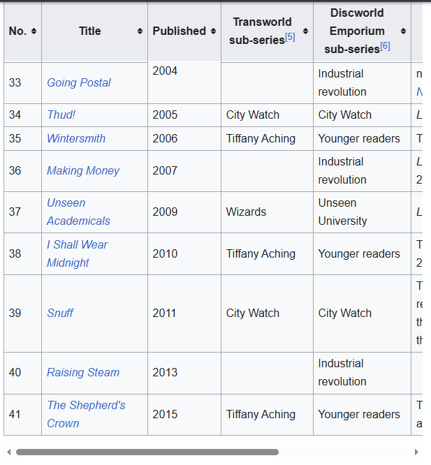
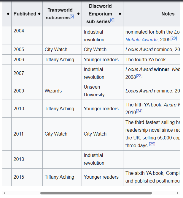
If single-axis scrolling is supported, you should be able to scroll the sections and also see the header cells sticking to the top of the page. If not, the position:sticky; part won’t work.
Here’s an example of how this looks in Chrome Canary currently. In both screenshots I’ve scrolled to the bottom of the Bibliography section; in the first I haven’t scrolled horizontally at all yet, and in the second I have. No JS involved!
-
Why am I writing about Leaguepedia in 2026? Because that’s how long I’ve been waiting for W3C to do something about this omg ↩︎
-
(Rather,
top:var(--wiki-top-navigation-height), because there’s a wiki top nav bar that takes up some space, and it’s different on mobile and desktop skins) ↩︎ -
You can see a Bugzilla ticket about this from 2017, but since the behavior was to spec, it was not actually a bug. ↩︎
-
Or October 1st, depending on your time zone ↩︎
-
Okay, depending on the type of table, you might need to replace
.wikitable > thead > tr:first-childwith something like.wikitable > :first-child > tr:first-childor.wikitable > caption ~ * > tr:first-child. If you’re writing CSS for your own wiki (or other website) where you control what classes get put where, please do something like<tr class="sticky-header">thanks ↩︎